|
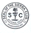
1892-1894: The first Sierra Club seal was created in 1892. It depicts a giant sequoia (Sequoiadendron giganteum) centered between the letters S and C. Below this is the Latin phrase Altiora Peto, meaning "I seek high places." Around and above the tree, motto, and letters are a circle with the words "Seal of the Sierra Club." Two five-pointed stars separate these words from "Incorporated 1892."
|
|
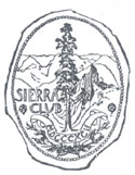
1894-1939: After dissatisfaction with this first logo, alternatives were solicited in 1893. The Club adopted the second seal, designed by San Francisco architect Willis Polk, in Spring 1894. A less stylized giant sequoia is in the foreground, with Yosemite's Half Dome behind it, and larger mountains in the distance. The irregular edges are meant to imitate sealing wax.
|
|
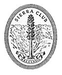
1940-1941: The Polk logo remained in use until the February 1940 issue of the Sierra Club Bulletin, when a modified version appeared in the masthead with a four-ring outline, new typeface, and repositioned lettering.
|
|
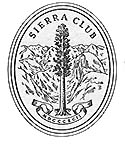
1941-1946: In the February 1941 issue of the Sierra Club Bulletin, the rings changed from four to three, but the Board minutes from June 15, 1941, noted that "the old form of the seal [the Willis Polk version] … was still to be considered as the official form of such seal."
|
|
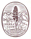
1946-1993: In December 1946, the seal changed again in the context of a redesign of the Sierra Club Bulletin. The basic design elements remain the same, but the words Sierra Club are in bold, lines appear in the sky, and a single line surrounds the logo.
|
|
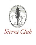
1985: A more stylized logo briefly appeared on Sierra Club letterhead, having been designed under the direction of then executive director Douglas Wheeler.
|

|
1986-1993: At its meeting in February 1986, the Board of Directors adopted a Standing Rule that said: The official design of the Sierra Club seal shall continue to be the attached version designed in 1941, depicting a Sequoiadendron giganteum, Half Dome and other Sierra Nevada peaks, with the words "Sierra Club" in bold serif type, and the date "MDCCCXCII" on a banner, all surrounded by a solid elliptical border. Only this design, or the earlier version of the same design created by Willis Polk about 1894, may be used as the Sierra Club logo. No modifications of this logo or other designs shall be used in place of the above logo without specific approval of the Board of Directors. (This resolution was incorrect about the design date of the logo then being used in the Bulletin; the 1941 date should have been 1946.)
|

|
1992: During the celebration of the Sierra Club's centennial, a special logo, incorporating elements of the Willis Polk design, was made available.
|
|
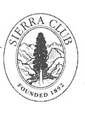
1994-1998: A new logo designed by Sharon Williams and Ellen Reilly was approved by the Board of Directors at its meeting in February 1994. It depicts a giant sequoia and Half Dome with mountain peaks in the background. An elliptical border contains the words "Sierra Club" at the top and "Founded 1892" at the bottom in ITC Garamond type.
|
|
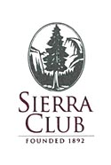
1998-2014: At its July 1998 meeting, the Board adopted a new logo designed by John Bielenberg. It depicts a giant sequoia and Half Dome with a mountain peak in the background and has an elliptical border. The words "Sierra Club" and "Founded 1892" are underneath in Trajan type.
|
 

|
2015-Present: A new logo by the Sierra Club's in-house designers was adopted in 2015. Incorporating the same basic elements as the previous logo, it has a more accurately depicted giant sequoia and is better-suited to electronic media.
|
 
|
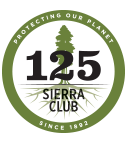
2017: A unique logo was designed to commemorate the Sierra Club's 125th anniversary. It includes the same giant sequoia featured in the general logo but also includes the tree's root system to represent growth. The words "Protecting Our Planet Since 1892" appear in a band around the logo's circumference.
|