 | By Ben WeinerChapter Communications Fellow |
A fun tool that is available to all is the EPA's Power Profiler. Put in your zip code and your electric company and it'll tell you the mix of fuels you use at home.
For example, let's take a look at my list of power sources and how much of them is renewable.
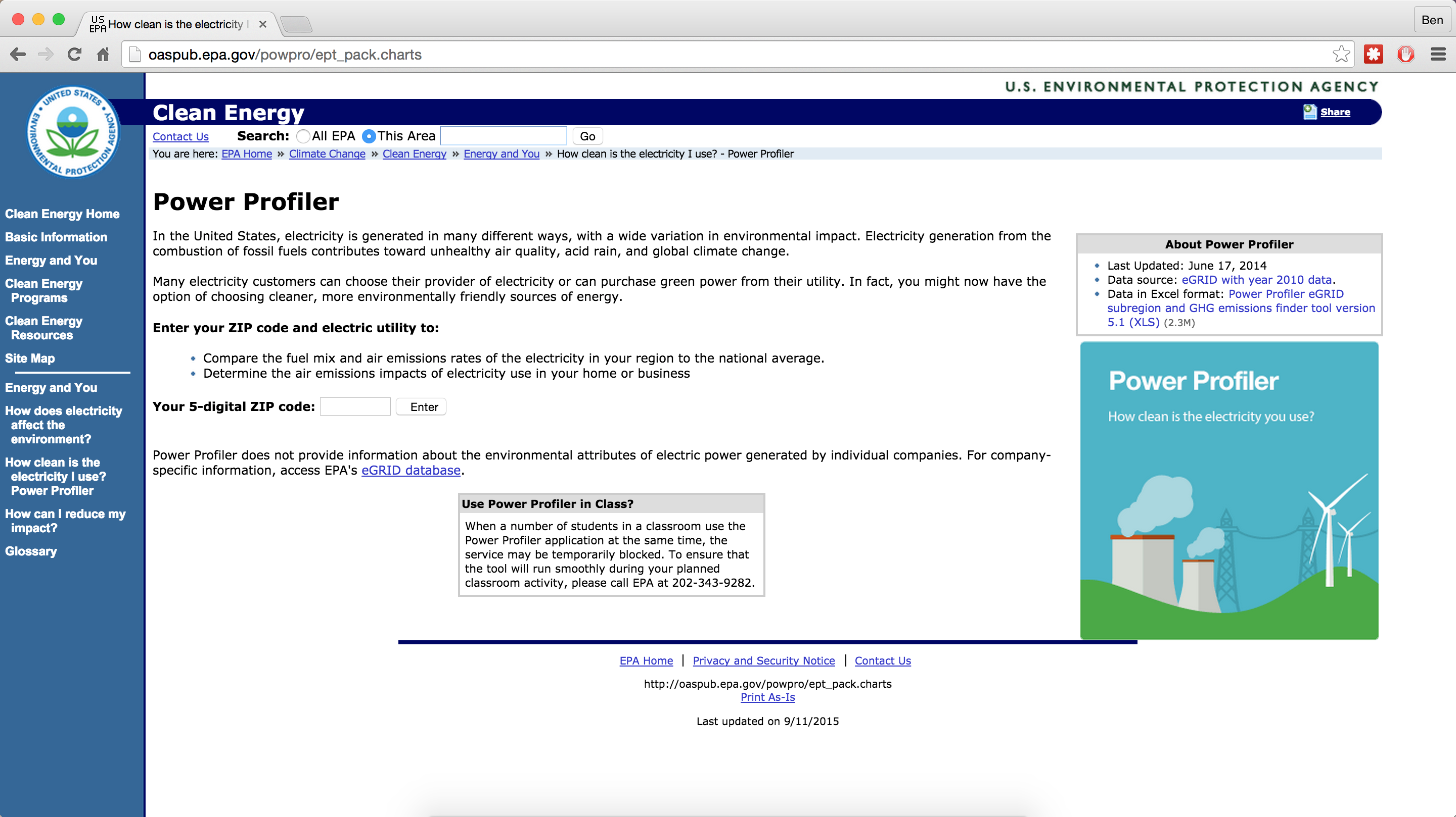
So if you open up the Power Profiler, it should look something like this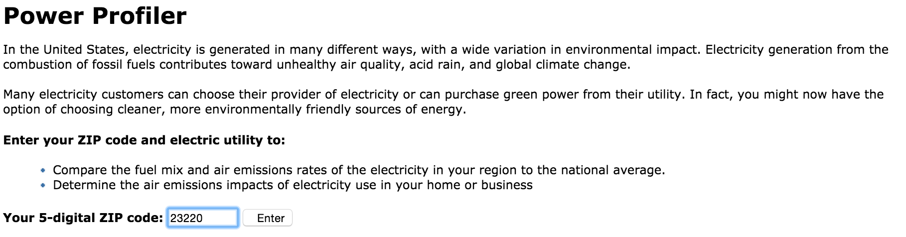
First things first, I added my zip code in.

Then I selected my utility (Dominion) underneath.
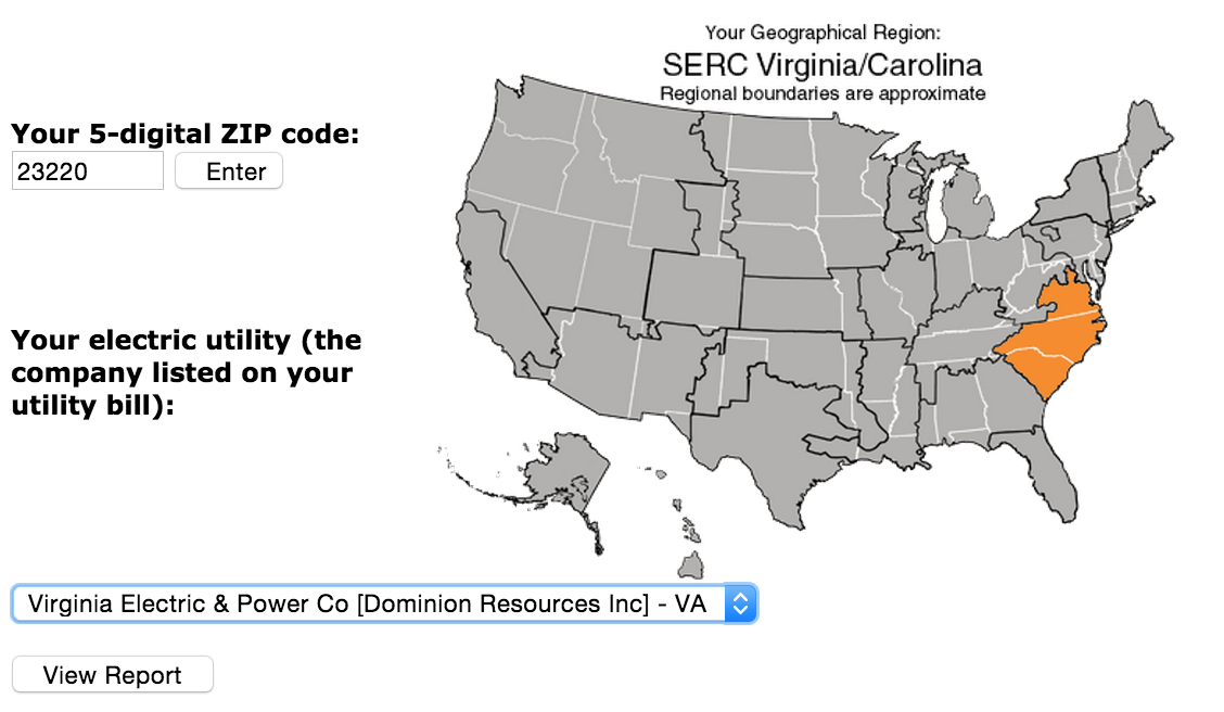
My region then pops up, which is most of Virginia, North Carolina and South Carolina.
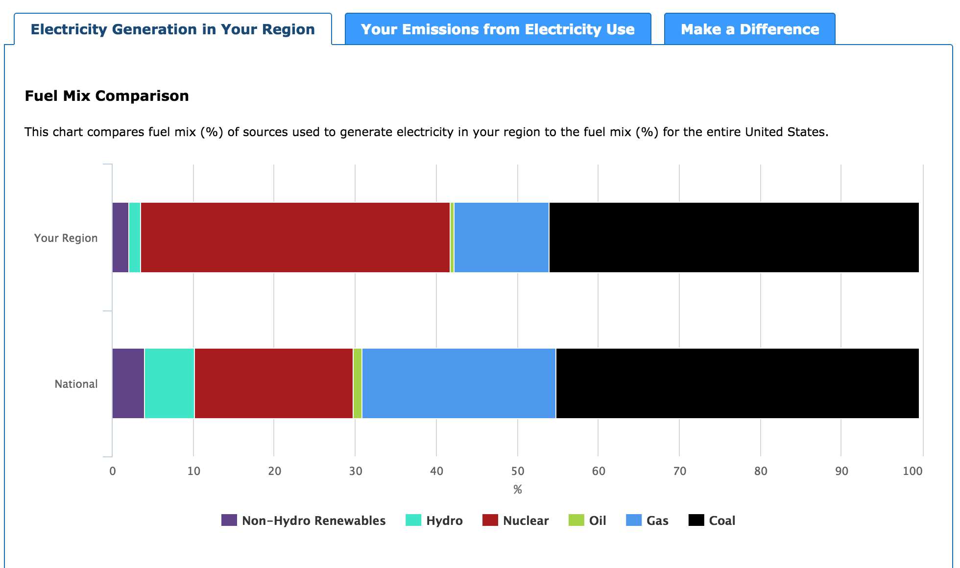
Then it gave me this graph for my region and where my power comes from. I live in The Fan in Richmond so you can think of that as a good example of this area. The bottom graph is the national average. Most of my power, like everyone else, is made from coal-firing plants, and then gas burning plants after that. (I know I'd like to change that- support the Clean Power Plan and you can too)
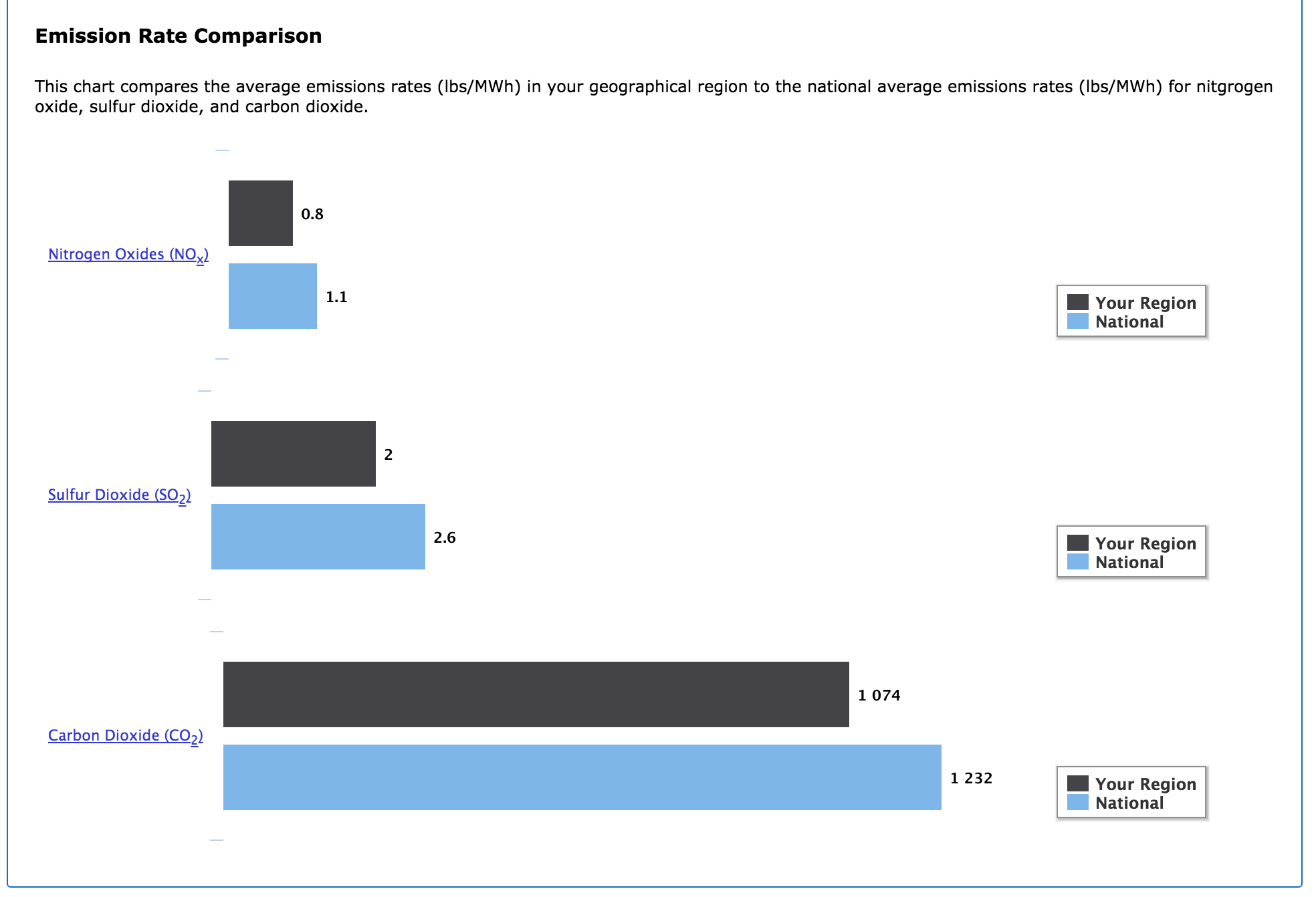
Then comes the really dirty part- my region versus the national average in pollutants. I was surprised to find that even though most of my electricity comes from dirty sources, my pollutants are all slightly lower than the national average.
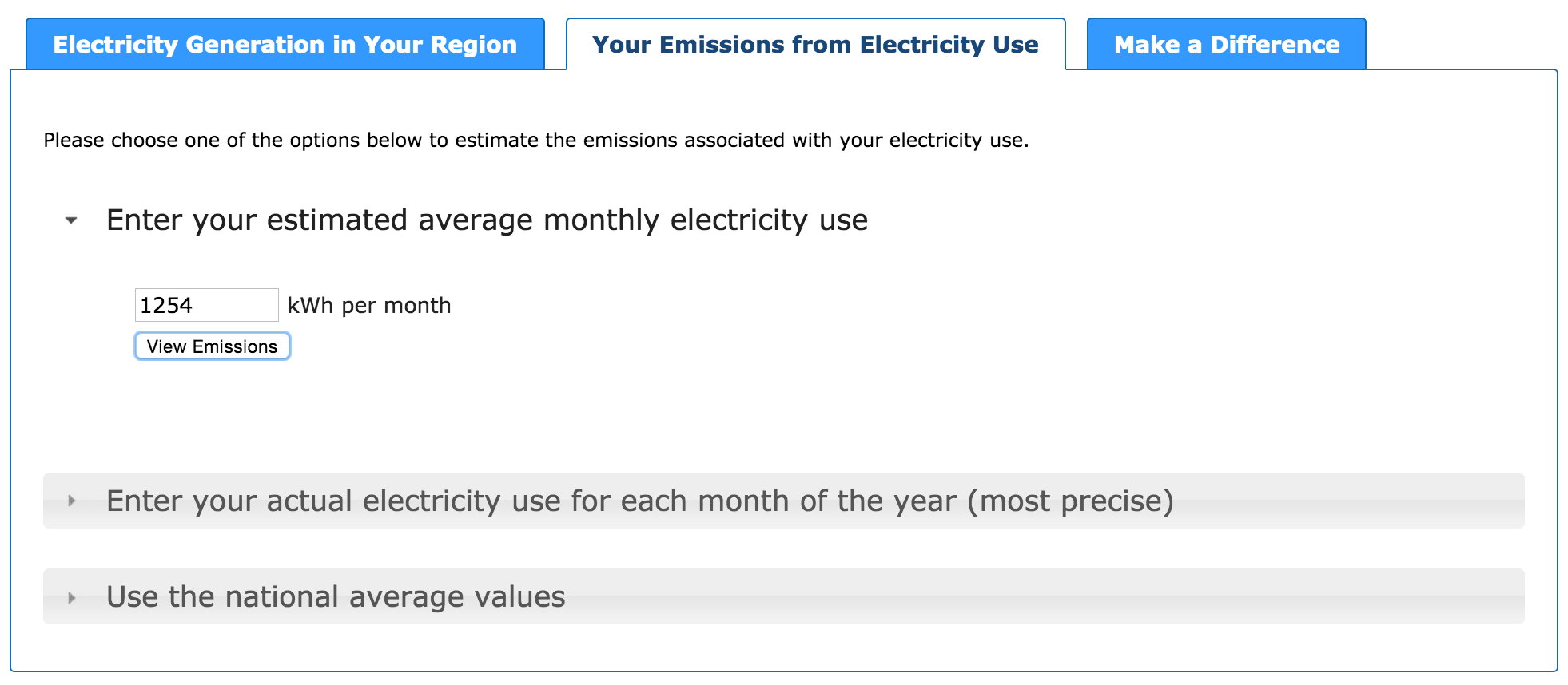
Now if I move over to the next tab, I get a lot more personal. I added a particularly high month of electricity for me and my roommate as an average so I could see a 'worse case senario' prediciton of my personal emissions.
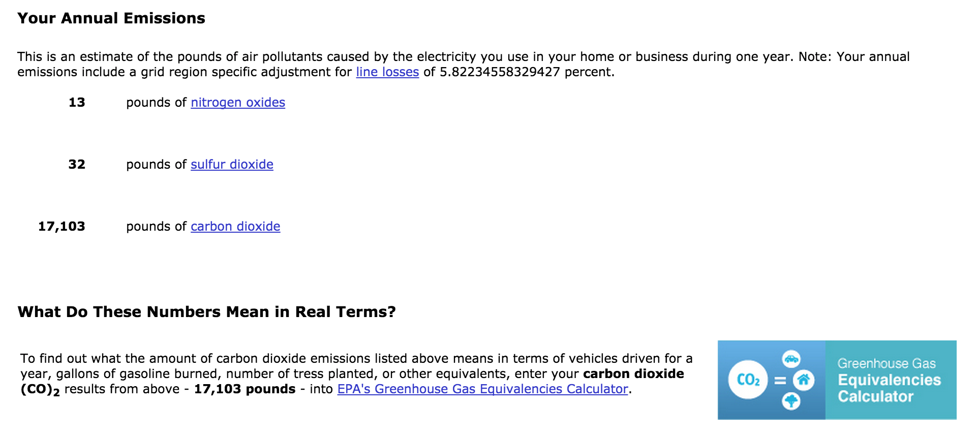
These are my personal pollutants. Next week, I'm going to take the website's advise and move over to the EPA's Greenhouse Gas Equivalencies Calendar with my 17,103 pounds of carbon dioxide each year and find some real terms.
So where does your electricity come from? How many pollutants do you put out? The Sierra Club's members and volunteers are spread throughout the Commonwealth so the answers are probably diverse. Share them with me on Facebook or Twitter!