By Nick Cheranich, Napa Group
One of the most useful ways to really understand how we use energy and to know where that energy comes from is by using this flow chart (known as a “Sankey Diagram”) produced annually by the Lawrence Livermore National Laboratory. In this article, I will explain the chart and point out some very interesting facts. I will also suggest some questions to consider, so that we may look deeply at what's at stake for our future and the future of our children.
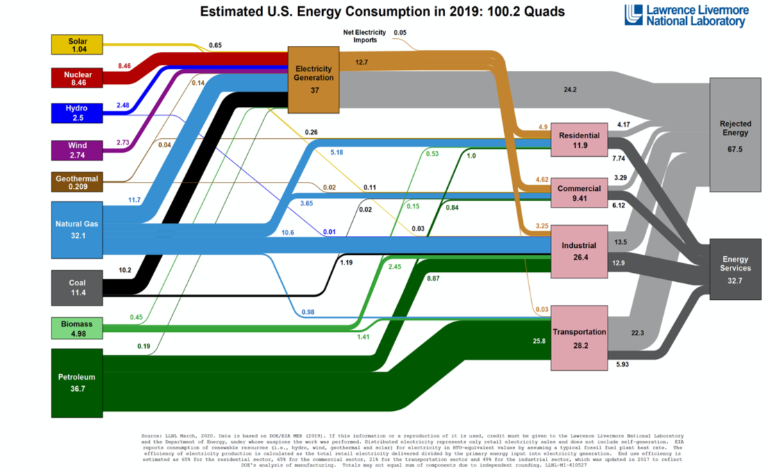
In the US, we use roughly 100 quadrillion Btu of energy per year (which is about 18% of the global energy used). Briefly, a Btu (British Thermal Unit) is the amount of energy needed to heat one pound of water by 1 degree Fahrenheit. One Btu is equivalent to the amount of energy produced from the burning of one kitchen matchstick.
(For context, here are some facts about Btu. 1 kilowatt hour (Kwh) of electricity, which is the amount of energy it takes to light an efficient LED lightbulb for a week = 3600 Btu; 1 gallon of gasoline = 120,000 Btu. Lastly, if we divided the total amount of Btu that the US uses by the total number of people in the US, we get a per capita rate of 303.3 million Btu of energy used per person per year. That's a lot of matchsticks! Oh, and by the way, we use Btu to measure energy use; we use metric tons to measure carbon emissions.)
As you look at the chart, it “reads” left to right. (If you are an audio/visual learner, here is a video that explains how to read the chart.) On the left, you have all the energy resources from which our energy needs come. As you can see on the lower left, the US uses about 37 quadrillion Btu of Petroleum, out of the global total of 100 quadrillion. Since we have a base of about 100 “quads,” we can conveniently refer to percentages instead of Btu. So, about 37% of our total energy needs comes from Petroleum. By contrast, Solar Energy represents just over 1% of our total energy needs.
At the right of the chart, you can see the four pink boxes, which are the sectors where this energy “flows” to and is consumed: Residential (households-that's you and me), Commercial (offices, hospitals, schools, restaurants), Industrial (factories, mining, agriculture), and Transportation (planes, trains, and automobiles—plus large container ships). As you can see, within these four sectors, the Transportation sector consumes the most energy at about 28%.
The yellowish box at the top middle is the amount of Btu needed for Electricity Generation. Most of our energy needs (37%) goes towards making electricity. Notice how most, if not all, of the “Renewable energy” resources such as Solar, Hydro, Wind, Geothermal, and Nuclear go into making electricity. Meanwhile, about 37% of Natural Gas and 89% of Coal go into making electricity.
All the way to the right are two other boxes called Energy Rejected and Energy Services. An example of Energy Rejected is the amount of energy that leaves your car through the radiator and exhaust pipe in the form of heat energy. An example of Energy Services is the energy that makes your car actually go.
See how the energy sources split up and flow to the various sectors? Every time I look at this chart, I see something new. Although it's a little confusing at first, several observations can be made.
Here are some of the "Aha's" that I've found from my observations:
· About 85% of our energy needs comes from burning fuels that emit greenhouse gasses (Petroleum 37%; Biomass—although not a fossil fuel, it comes from “renewable” plants such as corn, but is still burned—5%; Coal 11%; Natural Gas 32%)
· The other 15% of our energy needs come from renewable, non-greenhouse gasses emitting energy. However, over half of that 15% is from Nuclear Energy. That means around 6% of our energy needs currently comes from "clean" renewable energy such as solar, wind, etc. And those sources mostly go towards making electricity only.
· About 64% of our energy needs are non-electric. This energy comes from fossil fuels that mainly are consumed by the Transportation, Industrial, Commercial and Residential sectors.
· Only a third (32.7%) of the energy we use actually does any “work” in the form of Energy Services. Two-thirds of all energy used is wasted, aka: Energy Rejected.
Here are just a few questions raised by this data.
· How are we going to get that 6% of clean renewable energy sources like Solar and Wind to 100% (or even to 50%) by 2030, or 2050, without drastically reducing energy consumption and dramatically increasing renewable energy investment?
o We also have to factor in the amount of fossil fuel energy needed to extract and then produce the materials to make these renewable energy sources. Can this be done without impacting the environment and the local communities in which these materials are found?
· Since about 64% of our energy sources are from fossil fuels that mainly serve the various sectors as non-electric energy, how do we convert those sectors to using primarily electricity in order for us to go places, to make things, and to cook our food and heat our homes? (It should be noted that some industrial businesses do make their own electricity at their sites. Also, much of the fossil fuel used is for the raw materials that create products such as plastics and chemicals.)
· Since nearly two-thirds of all energy used is wasted (for example, nearly 65% of the energy used to make electricity, and 80% of energy used to power most vehicles, is wasted), is it not imperative that we demand the design and engineering of ultra-efficient machines?
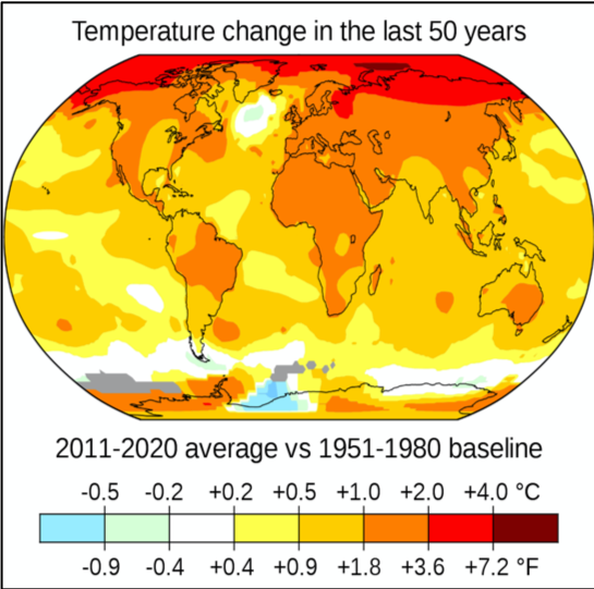
As we now know, much of the energy used from burning fossil and bio fuels creates greenhouse gases that contribute to global warming and the resulting harmful changes to the climate. (In the U.S., roughly 6,700 million metric tons of CO2 equivalent is spewed into the air annually. For comparison, a small car is likely to weigh one metric ton. Thus, a million metric tons is equal to one million small cars!) This chart alerts us to the fact that real, drastic changes must occur for the continuous spewing of greenhouse gases to slow and eventually to stop.
And this does not even address the amount of CO2 already in the atmosphere that needs to be captured or sequestered. If we were able to stop burning all fossil fuels today, the atmosphere would still contain a tremendous amount of carbon gases, because they stay in the atmosphere for a very long time. We must also consider whether, besides the natural processes of carbon sequestration (i.e., trees, oceans), are there other effective technologies to trap and then store these gases that do not require the burning of fossil fuels?
It seems that we have dug ourselves into a pretty deep hole. My intent here is not to scare us into complete apathy. But I hope these facts provide a clearer picture of our current predicament, so that we can face our reality and do what is needed to end our apathy and act realistically—now—to help save the planet.
What are some things we can do?
Reduce our own carbon emissions by lessening our energy usage. About 40% of carbon emissions comes from households just doing what we do every day: driving, keeping our homes and food warm and cool, eating, and dealing with our waste. We can use the tools on the website Regeneration.Napa.org to first calculate our emissions, and then take effective actions to reduce them. By doing so, not only can we save money, but we can also do it together, with groups of fellow concerned Napans. By working in the site, I was able to reduce my own emissions by 76%. Heck, it's a start.
Join and become involved in Climate Action and Climate Justice groups, such as the Napa Sierra Club and Napa Climate Now. These groups clarify the various issues and the steps needed to bring about the needed political policy changes. Or, consider joining groups such as Extinction Rebellion, which uses non-violent civil disobedience measures to force governments to act.
Keep educating ourselves. This piece from the NY Times discusses a new study by a team of energy experts at Princeton University. It shows that “if the United States wants to get serious about tackling climate change, the country will need to build a staggering amount of new energy infrastructure in just the next 10 years, laying down steel and concrete at a pace barely being contemplated today.” Both NASA and Climate.gov are good reliable sources of information.
· Want to see energy flow charts of California and other states? Check it out here. It's interesting to compare how states differ in where their energy comes from and how it is consumed.
Keep the discussion going. I would love to hear from you about your observations, questions, conclusions regarding this flow chart. Maybe I could use them in a follow up article. If interested, please email me at napavalleysierraclub@gmail.com. Thank you.
Nick Cheranich is a retired teacher in Napa, having taught mostly at Silverado Middle School. He is the Chair of the Napa Sierra Club Executive Committee and a volunteer with Napa Schools for Climate Action. He likes to ride his bike, hike, and tend to his succulent garden.